

Blueberry Crumble-Inspired Color Palettes
I remember as a kid being given the opportunity to redecorate my room (within the limits and price-range of appropriate for a nine-year-old). Though I wasn’t allowed to go on an endless shopping spree at IKEA, I was allowed to choose a paint color for my walls.
I chose dark purple. By fifth grade, I asked my dad to cover the purple with lime green. By high school, my parents trusted me enough with a paint brush to repaint my room a soft blue.

I share this not to highlight my decorating skills as a child but actually to declare how awful they were.
Each time I repainted my room, I felt completely lost when it came to an overall color palette.
I was scared of color.
Instead of allowing many colors into my room, I gravitated towards a color palette featuring only the color on the walls. Which meant my room didn’t just have purple walls, it had purple everything, even down to the bedspread.
Maybe you’ve felt this way before- totally lost on color. Maybe you want to paint or wallpaper a room but color is holding you back. Maybe you even want to use our gorgeous wallpaper designs! Or maybe you’re an experienced interior designer just looking for some color-inspiration to pair with our wallpapers.
Whatever the case, this post is dedicated to overcoming color fears by showcasing five color palettes inspired by one of our wallpaper patterns, “Blueberry Crumble”.
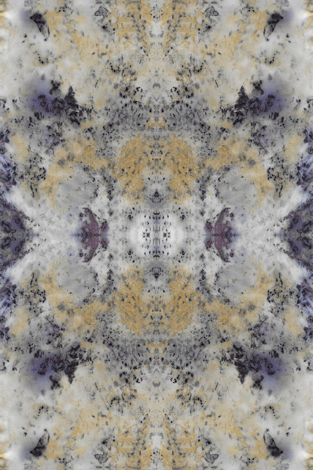
Blueberry Crumble is an energetic statement pattern, great for an accent wall or lively space. Below is a base color palette that features dominant hues found in Blueberry Crumble.

This base palette can be used if you need to refer to the hues found in the pattern.
While this palette is definitely useful in making design decisions- a word of advice- don’t do what I did as a nine-year-old and make your whole room a giant Blueberry Crumble (although that sounds delicious, I’m not sure design-wise this is what you’ll be after).
Instead, allow other colors not in the base palette to come to the fore. They will highlight and compliment the pattern, especially if it is used as an accent wall.
Here are a few Blueberry Crumble inspired color palettes:

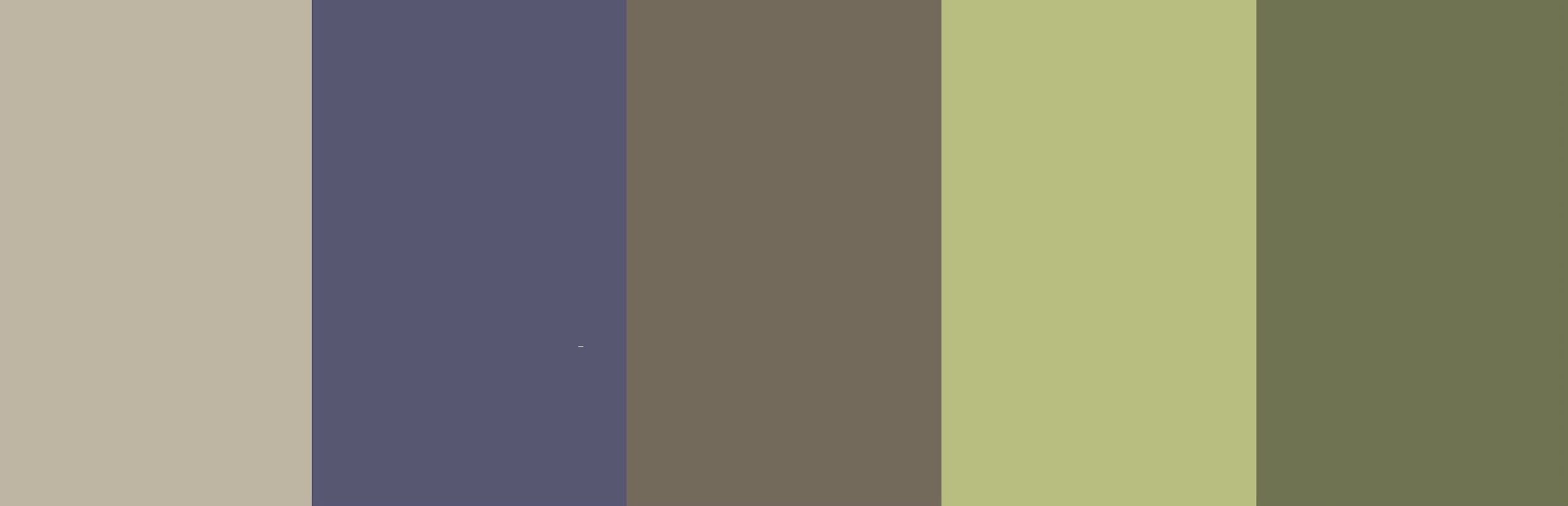


Note how in each one the second hue from the left (violet) remains the same- this is the core color, or dominant color, pulled from Blueberry Crumble that affects the entirety of the color palette.
As you look at each palette, which colors stand out? Which colors feel energetic? Provide rest? What is the mood of the palette? What room or physical space would the palette work well in? What decor or homewares could take on these hues?
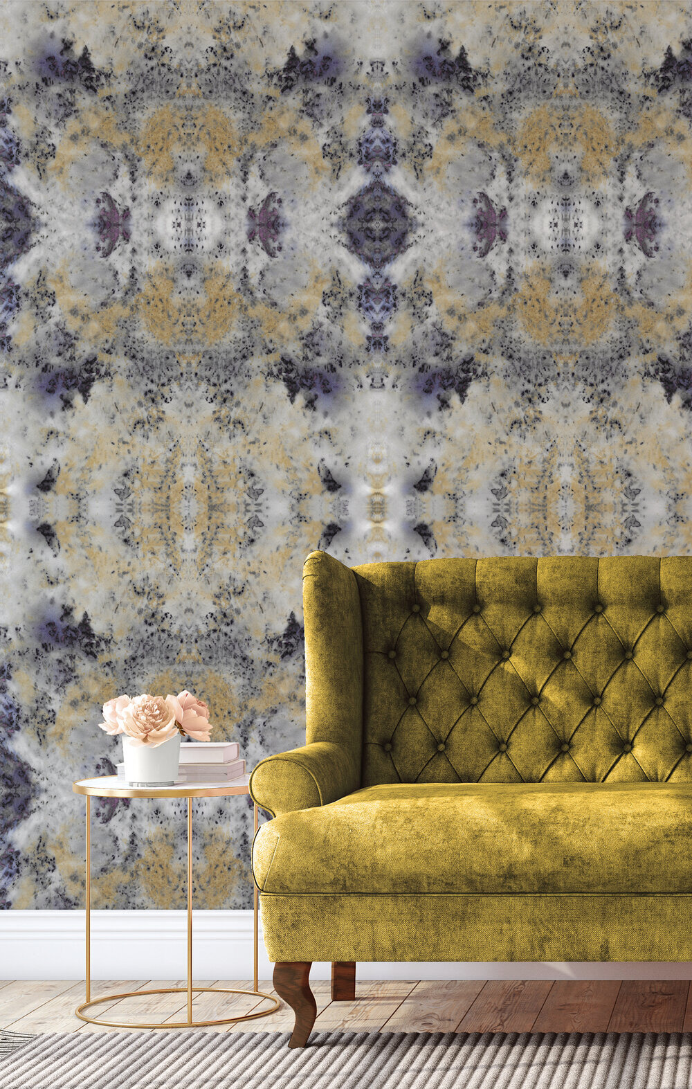
What other colors could you pull in? Be adventurous- look at the pop the peonies give in the photo below, or how the yellowy-green couch contrasts with the purple hues in the pattern.
By inviting other colors and tones not directly found in Blueberry Crumble into our palettes, we are able to create stronger visual interest, greater contrast, and introduce more variety within a space.

We don’t need to fear color- only to play and be creative with it.
We hope these palettes inspire you and are helpful when incorporating Blueberry Crumble into your space.
Stay tuned for future color palette posts inspired by more of our wallpapers!
-Emily (The Intern)